# What Makes a Website High-Converting?
The short answer: A high-converting website has a clear headline that explains what you do and who you serve, a strong call to action above the fold, social proof (reviews, results, numbers), fast load time, and mobile optimization. Every element on the page should move the visitor closer to taking action.
The 7 Elements of a High-Converting Website
1. A Headline That Passes the 5-Second Test
A visitor should know exactly what you do and who you serve within 5 seconds of landing on your site. Not your company name. Not a tagline. What you do and for whom.
Good: "We Build Websites That Bring You More Clients, Delivered in 7 Days"
Bad: "Welcome to Our Website"
2. A Single, Clear Call to Action
Most websites have too many options. High-converting sites drive visitors toward one primary action, book a call, request a quote, buy now. Everything on the page supports that one action.
3. Social Proof Above the Fold
Reviews, client results, logos of companies you have worked with, or a simple stat ("50+ businesses served") build trust fast. Put this near the top of the page, not buried at the bottom.
4. Fast Load Time
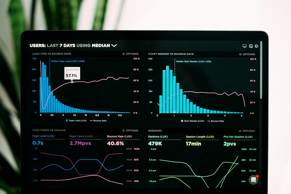
53% of mobile visitors leave a page that takes more than 3 seconds to load. If your site is slow, it does not matter how good the copy is. Aim for under 2 seconds.
5. Mobile Optimization
Over 60% of web traffic is mobile. If your website is not built mobile-first, you are losing more than half your visitors before they read a word.
6. Answers to Objections
What stops your ideal customer from buying? Price? Trust? Uncertainty? Your website should directly address these, through FAQs, guarantees, transparent pricing, or case studies.
7. Clear Next Steps
After reading your page, what should the visitor do? Make it obvious. A button. A form. A phone number. Do not make them guess.
What Most Small Business Websites Get Wrong
- Homepage copy is about the company, not the customer
- No clear call to action (or too many)
- Social proof is missing or buried
- Contact page with only a form, no phone, no email, no address
- No pricing transparency (visitors leave to find someone who shows prices)
Quick Wins You Can Do Today
1. Rewrite your headline to focus on what the customer gets, not what you do
2. Add a "Book a Call" or "Get a Quote" button at the top of your page
3. Add your 5 best Google reviews to the homepage
4. Make sure your phone number is visible on mobile
A high-converting website is not about looking impressive. It is about making it easy for the right people to say yes.